Wednesday, 30 May 2012

The Case of the Vanishing Overspray

2012-05-303

Well hello there limited edition blush in Sakura from MAC’s spring 2011 Quite Cute Collection.  How are you doing these days?  What’s that?  You’re not the blush you once were?  You’ve been feeling much paler lately?  Hmm, this calls for further investigation…

Sakura is not one of my favourite blushes but I quite like the colour and I want to get my money’s worth so I’ve been using it quite regularly lately.  This week the pink heart design started fading away in the middle and now there’s a gaping hole in it as it’s actually only an overspray that goes down just a couple of millimeters in the design.  This means that when the heart runs out the colour of the blush is going to change completely – which I find really, really annoying!

IMG_6613

IMG_6623

Above: 1 – central heart; 2 – surrounding colour; 3 – both shades mixed

I currently use this product by swirling a big fluffy kabuki brush over the entire surface, so I end up with a shade like 3 above which I lightly buff across my cheeks, but once the heart has been used up I’ll be left with a much lighter, more lilac pink shade. I find it almost “insincere” that this product is changing colour after I’ve already used it so much and grown fond of the shade I’ve grown used to.  Does anyone else get annoyed by fading oversprays, or is it just me??

Shop MAC, Cook MAC: Flaunting It

I am on a MAC cooling-off period at the moment but I did buy a few items earlier this spring that I haven’t gotten round to featuring on the blog yet.  Anyway today I finally got round to taking some pics of one of my favourite items, a Kissable Lip Colour in the shade Flaunting It.

The Shop MAC, Cook MAC products came in special edition colourful packaging…

IMG_6535

which I really dislike!  It’s not the design but rather the fact that it’s actually just an additional cardboard sleeve which contains the normal black MAC cardboard packaging anyway and I really dislike excess packaging!  I know I’m not in a good position to start moaning about excess consumption given the amount I shop but still there’s just no need, there’s just no need.

2012-05-301

For £16.50 you get 5g of product.  It’s not a lot.  The tube is very thin and comes with a largely unspectacular doe foot applicator.

2012-05-302

The texture is very creamy and moisturising, but not at all sticky or thick.  It’s easy to apply using the doe foot applicator and I have to say that it lasts pretty well.  If I pop this on on the bus to work then it sees me through to lunchtime no bother.

I really like the colour, which is a purple/mauve shade that I could see myself wearing all round the year.

IMG_6564

IMG_6582

All in all I quite like this product but I am I alone in thinking that the pricing is crazy?  I wanted to try it out to see if there was something spectacular about it, but there really isn’t so personally I can’t see myself buying this again.  I know that MAC has a massive fan base and is often described as good value or affordable but personally I really can’t see what all the fuss is about.  Maybe it is more affordable in America where this lip product does not cost three times the minimum hourly wage?  I just don’t know!

H&M Summer 2012 Lipstick in Pink Sea Shell

I will admit, I did just buy this lipstick because I thought the packaging was cool!  H&M have a range of lipsticks out this summer in tubes that match a selection of the prints of their summer 2012 clothes collection.  I went for this nude pink shade as at £1.99 I wasn’t expecting the quality to be great so I decided to go for a colour that could fade gracefully.

2012-05-30

I find the colour very ‘90s…it reminds me of the nude lipstick that Pamela Anderson used to wear actually!  It’s quite a shiny, sheer light coral pink.  I tend to pop some on when I’m on the bus to work in the mornings and it tends to have faded away by my second cup of morning coffee around 11am.  The formula is very moisturing and shiny so I guess it has a high oil content.

IMG_6508

IMG_6531

Maybe worth checking out if you’re interested in a cheap and cheerful light coral lippie for summer, but best skipped if you need something with a bit of staying power and you’re willing to pay more.

Sunday, 27 May 2012

MAC In Extra Dimension

I would like to start this post with a disclaimer that what you are about to see does represent a horrendous amount for me to have spent on make-up at one time, but what can I say?  I was feeling quite stressed the week I bought all of this and buying make-up calms me down!!

MAC released a collection called In Extra Dimension about a month ago which comprised three Skin Finishes, ten eyeshadows, and a couple of brushes.  They’re mostly still available online so if you’re interested in this collection there’s still time to check it out.  I was quite interested after seeing the initial promotional pics and the trickle of initial reviews on the blogosphere so I thought I’d pick up a couple of items.  Well, in the end I bought three eyeshadows (£16.50 each) and a skinfinish (£20.50) then sat there wondering how long I’d have to skim a bit off my lunch money each day to pay for it all lol.  These products are ridiculously expensive but at the time I had to have them.  Anyway onto some pics.

IMG_6435

IMG_6436

Genuine MAC products never have the shade name printed on the box; instead they have a sticker with the shade name on it, as with the box above. The containers themselves also have a sticker on the back with the shade name.

Above, clockwise from left: eyeshadow in Grand Galaxy, skinfinish in Whisper of Gilt, eyeshadow in Havana, eyeshadow in Modern Pewter.

Below, clockwise from top: eyeshadows in Modern Pewter, Grand Galaxy and Havana.
IMG_6446

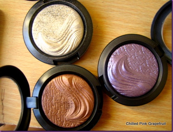
The colours are all quite neutral and all are very shiny.  The product comes in an interesting raised wave design on the lower half with the letters MAC pressed into the top half.  It looks pretty cool on the products when they’re new…

IMG_6451

Above: Havana eyeshadow

IMG_6453

Above: Modern Pewter eyeshadow

IMG_6469

Above: Whisper of Gilt skinfinish

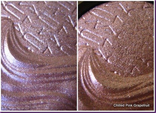
As you can see from the photos above, the smooth texture of the design is tarnished from the first use of the product, and I don’t think it actually looks attractive at all the way it wears.  It looks crusty and as if it’s oxidising…not very appetising at all!

Below you can see how Grand Galaxy looked brand new and after one finger swipe that I made to do a swatch.  The MAC writing has clearly been erased where my finger touched the product.
2012-05-275

Anyway, packaging and design is one thing; how do these products actually wear on the skin?  Here are swatches on my arm.

Left to right: Whisper of Gilt, Modern Pewter, Havana, Grand Galaxy

IMG_6479

The consistency of all the products is smooth and creamy. They are in fact being marketed as a new gel-to-powder formula…hmm, whatever.  Me, Modern Pewter and Havana have gotten along just fine each time I’ve worn them to date – the colour in the swatches above is how they appear on me when worn as eyeshadow and I have no issues with application or wear.  They last fine all day over a primer.  I like Modern Pewter in particular as it’s quite an unusual colour, an olive gold, and I don’t really have anything similar in my collection already.  Grand Galaxy I just can’t comment on as I haven’t worn it yet.

Whisper of Gilt however is a disaster on me.  I can’t even get it to last four hours on my combination skin.  I can see it when I apply it in the mornings, then by lunchtime it’s just totally disappeared.  It’s annoying and frustrating given how much I paid for it and I actually wish I hadn’t bought it.  I know that not every brand can make all of its products into hits for everybody and I had read practically nothing about this product but glowing reviews from other bloggers but with products as expensive as these it’s really not something I want to be bitten by twice.  For this reason I’m kind of sick of MAC at the moment and the inconsistent quality of the products that I’ve tried and I’m not going to be picking anything else up from them for a while.  Not that I haven’t already got enough products to keep me going for about the next ten years anyway I guess!

Illamasqua Fundamental Palette

This is one of the quad palettes from the Illamasqua Spring/Summer 2012 Human Fundamentalism collection (RRP £30).  I really was umming and ahhing over whether to buy it or not when it was released as I didn’t know if I’d actually get any use out of it, but in the end I was in the London Beak Street shop with a friend (it’s a lovely, friendly place BTW – definitley worth checking out if you would like to try out their products as the staff are super helpful and nice) and I thought I might as well buy it just so I could stop thinking about it!

IMG_6227

Above, clockwise from top left: powder shadow in Hype, Liquid Metal in Surge, powder shadow in Inception, Cream Pigment in Bedaub

Below: A collage which you can click on for a closer view of the individual shades

2012-05-274

I think I like the idea of this palette more than I like the palette itself.  It contains a mixture of colours and finishes but to be honest I think I just lack the imagination to get the best out of this!  I don’t really know how to put these together into a look and I’ve only really used the cream pigment in Bedaub so far. 

Bedaub’s both a great colour and texture in itself but also makes a great sticky base for glitters or pigements, and can also be used as a pre-foundation colour corrector to neutralise red areas. 

The liquid metal looks absolutely amazing on skin – the name “liquid metal” really fits. However, I just don’t know how to wear it.  It’s very slippery and creases insanely if worn on the moveable part of the eyelid, and it’s a strange colour to wear as an everyday highlighter or lipcolour. 

Hype, the bright yellow eyeshadow, is just a bit of a tricky colour to pull off, while Inception lacks a bit of oomph and can look a bit washed out and create a bit of a “bruised” effect unless it’s packed on.

IMG_6265

I think either more experimentation or parties (where as a rule I wear weird make-up!) are required on my part…any hints or tips on this one would also be appreciated!

The Day After Eurovision

I love the Eurovision Song Contest; it’s such a fun event and always great entertainment.  Even though I stayed in to watch it last night I should have done a fan look that I could’ve posted to the blog for fun but I just didn’t even think of it till this morning to be honest and there didn’t seem to be much point doing a fan look today given that we came second last this year!

Here’s what I’m wearing today instead.  I used shadows from my new Accessorize 32 Shade Eye Palettes.

2012-05-27

It’s a simple horizontal gradient of blues.  There’s a lovely selection of bright blues in the palettes.  Right, now I’m off to rock this look in my garden where I’m going to soak up some late afternoon sun!

Accessorize 32 Shade Eye Palettes

I was very excited to discover in Superdrug on Friday that Accessorize have added some new items to their make-up line.  Accessorize is one of my favourite high street make-up brands so I just had to grab their two new 32 Shade Eye Palletes straight away.

There are two colour options; Lovely Day (leopard print cover) and You Are Everything (Union Jack cover).

IMG_6275-001

You get 16g of shadow in total in each palette so 0.5g of each shadow and the pans are about the size of a 1p piece.  Lovely Day contains a mixture of neutral shades while You Are Everything contains a slightly more colourful selection.

First up here’s a closer look at Lovely Day.

IMG_6278

You can click on the collage below for a slightly bigger view of the shadows.

2012-05-273

And now You Are Everything:

IMG_6305

Again you can click on the collage below for a closer look.

2012-05-272

Well I really love both of these palettes; I think you get a great selection of colours and finishes (mattes, shimmers and metallics) and the price is good too with the palettes currently retailing for around £9 each.  Actually Superdrug are running a 3-for-2 promotion on cosmetics at the moment so I picked up their new mascara at the same time.  It’s called Fibre Lash Lenghtening mascara and costs around £7.

IMG_6337

IMG_6335 

The packaging as usual is super cute; a violet tube with pictures of butterflies on it.  The wand of this mascara is hard plastic, with short bristles on one side and longer bristles on the other.  I guess you can wiggle the short brushes through the roots of your lashes to build root volume then brush the longer bristles through to the tips to build length.  I think mascara is such a difficult product to provide a good review on as the user experience depends so much on the lashes that you start off with.  I’m afraid that even though I love the fact that this is so buildable (I’m currently wearing 5 thin coats and I could’ve gone for another three or four) without clumping, but this mascara just doesn’t do it for my puny lashes.  I need something that’s a bit clumpier to be honest to build a bit of volume.  The Accessorize Flutter Curl mascara is much better for me.

Here’s a pic of the Accessorize Flutter Curl mascara wand with a trendy photo effect:

IMG_6343

And a quick side-by-side comparison so you can see the similarities and differences in the wands and packaging:

IMG_6358