Sunday, 30 October 2011

And now for some calm…

This weekend there was a huge gathering of yoga fans in West London at the Yoga Show 2011.  I try to practise yoga and meditate occasionally so I headed over to the Kensington Olympia with a friend today to see what was on offer for the final day of the three day long show.

We paid £10.50 for our day tickets, but we were really impressed by the great variety and number of interesting stalls, workshops and free classes that were on offer.  Unfortunately we were a bit rushed this year as we could only spend a couple of hours there but we already promised each other that we would go back next year and spend more time there, next time maybe taking a bit of a shopping list and choosing a few classes to attend.

I love yoga clothes but I didn’t buy any this time as they can be a bit expensive (but that’s not to say that they’re not good value if you wear them often as the quality of the goods on offer seemed very high) but I did pick up this cute meditation balm by Badger Balms.

2011-10-304

How cute is the packaging??

IMG_3260

Above: This tin contains 28g so it’s slightly larger than a lip balm tin.  I took a photo next to my Blackberry to give an idea of the size.

Badger do loads of different fragrances, this one just happened to be my favourite.  If you’re interested in organic beauty then this website which is an official UK stockist of Badger is definitely worth a look – not least because I’ve just discovered that the balms are much cheaper online than the price I paid!  Never mind, at least I know where to go to stock up next time.

It’s Body Shop Sale Time Again! Autumn 2011

The Body Shop seem to do sales all the time – but I suppose in reality they probably run them about four times a year, for about a month at a time.

The sales seem to be the time when they try to get rid of their excess stock of discontinued products, so you often see the same products pop up in their sales over and over again.  Well, for me it’s a good opportunity to pick up some Body Shop staples at knock-down prices.  Here’s what I picked up when I popped into one this weekend.
2011-10-301

IMG_3311

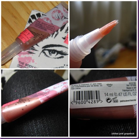
Above: High Shine Lip Treatment in 01 Pink Cream, reduced from £9.50 to £4.50

I wanted to get a new moisturising lip treatment so I picked up this gloss which was part of a limited edition collection a while back.  It still wasn’t that cheap at £4.50 but you get 14ml of product and it has a brush applicator which is my favourite kind.  On the plus side, I like the peachy smell, the thick and moisturising consistency, and the glowing sheer peachy colour, but I’ve only actually used it about three times and look how empty my tube looks already!  It looks like half the product’s been squeezed out of it it’s so flat.  I’m not impressed.  It was definitely not used when I got it as the applicator was completely clean.  Hopefully I just got a dud one because there’s just no way I can believe that I got 14ml of product in my tube – boo!

I also picked up an eyeshadow quad which was from the same now discontinued limited edition.  It’s called 02 A La Mode and I also have the other palette from this collection in 01 Boho Beauty which I wrote about previously.  The colours in this palette just scream ‘60s smokey to me.

2011-10-302

The quality of these eyeshadows is great and you get a massive 2.2g of each.  The swatches above were one swipe with no primer.  The only colour that’s not true to pan after one swipe is the black, but to be honest that doesn’t bother me so much as for one I hardly ever use black eyeshadow and for another I’ve got loads of other matte blacks anyway.  The palette also contains a generous mirror that fills the entire inner lid and a tiny shading brush that’s of pretty good quality.  The palette originally also came with a mini black kohl eyeliner pencil but neither of the palettes in the shop (there were only two left!) still contained theirs.  Again that’s not something that bothers me though for the exact same reasons as I’m not bothered about the black eyeshadow.

I also picked up some of my bath & body favourites:

top row left – right: passion fruit show gel, £2 for 250ml; brazil nut body butter, £5 for 200ml

bottom row: brazil nut body scrub, £5 for 200ml

2011-10-303

Even though I’m a fan of Body Shop products I hardly ever buy them at full price.  Why pay £6 for a shower gel or £12 for a body butter or scrub when I know that I can wait a couple of months to get them for these great value prices in the sale?

I love the fact that the passion fruit shower gel is soap free so it’s non-drying (I think perhaps all Body Shop shower gels are soap free?  I’m not 100% sure).  The smell is wonderfully fresh and fruity so it’s the perfect wake-me up shower gel for early autumn mornings when all I’m feeling like is zzz…

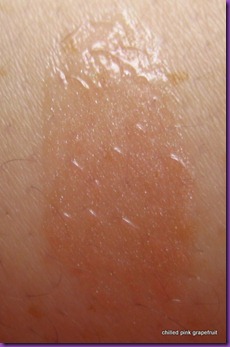
The Brazil nut range smells extremely sweet, nutty and creamy – so avoid it like the plague if you don’t like any of those qualities!  However if you do then it’ll be right up your street.  I happen to love it but I think it’s discontinued so I have to stock up when I get the chance.  The body butter is very rich and suitable for very dry skin – I think it could be a bit too rich if you have normal skin.  The body scrub is like a thick moisturiser which happens to contain some grainy bits.  You can see in the close up picture that the consistency is thick enough to hold its shape after I’ve scooped some of it out with my fingers.  I quite like this, but probably more because of the smell than for its amazing exfoliating properties.  It’s just OK as a scrub as the scrubby bits are a bit sparse.

So that’s me all stocked up until Christmas now I reckon, when I tend to get some Body Shop treats from Santa every year, hooray :)

Wednesday, 26 October 2011

Halloween Mascara

Well…not really, but that’s what I thought when I saw the packaging on the display so I thought it would be a fun addition to my make-up collection for the autumn.

IMG_3164

Scandaleyes mascara by Rimmel, around £7

I thought I’d do a very quick post just to show some pics of the mascara by doing a quick and very unscientific comparison with my hitherto favourite mascara by Rimmel, VolumeMax Bold Curves.  The packaging of both is really bright and garish…I think it does make them look a bit cheap, but it’s also good fun and makes them easy to spot in amongst a big pile of make-up or make-up bag so I have to admit that I quite like it.

IMG_3166

IMG_3167

Above: top wand – Volume Max Bold Curves, bottom wand – Scandaleyes

The thing I have to say about Scandaleyes mascara is that the wand is absolutely HUGE.  It’s bigger than my eye!  In the top photo you can see the Scandaleyes wand while the photo below is the Volume Max Bold Curves wand.  Sorry the pics are a bit blurry…I took these photos myself and it proved a bit difficult to hold the camera steady whilst attempting to photograph myself applying mascara.

2011-10-221

The Scandaleyes mascara has a very “elastic” consistency and it does tend to pull out of the tube with a big blobby strand of mascara on the end of the wand which you have to wipe off before letting the wand anywhere near your eyes.  However the performance is very similar to other Rimmel mascaras and I think it’s really not a bad buy.  The picture below shows my lashes with 2 coats of Scandaleyes mascara – the angle of the shot is not great but really there is not that much to show, my lashes are really so puny there’s only so much that any mascara can do for them.IMG_3182

However I think you can still see that they’ve been bulked up quite nicely by the mascara.

My favourite of the two mascaras is the Volume Max Bold Curves though because the brush is such a great fit for my lashes and it really does bulk them up.  I have had it for several months already though so it could just be that it’s performing better with age as my mascaras generally do, as drier, thicker formulas coat and bulk up my lashes better than runnier ones, so I suspect that in a few months when my Volume Max is starting to dry out my Scandaleyes will just be starting to come into its own.

Saturday, 22 October 2011

Aubergine Eyeliner + Pumpkin Eyeshadow

This is another look for the weekend which was inspired by my Autumn 2011 colour chart.

The Look

Contrasting textures and colours create a daytime look that’s anything but dull.

2011-10-22

The Products

My favourite priming product at the moment is the Sleek Primer palette.  The primers might not make my eyeshadows last quite as long as some others, but they’re smooth and creamy to apply which means they don’t tug at or dry out my skin at all – which is just as well as my skin has quite enough to cope with at the moment what with the changing seasons.  Today I used the peachy coloured one all over my lids to match the general colour theme that I was going for.

I then blended a bright matte orange on the outer corners of my lids and just above the crease, before adding a glittery nude to the inner half of my eyelids.  I used my Blingtone eyeshadow in Morococo which is fantastic because it’s super shiny and glittery but doesn’t cause any fall out.  The contrast of the matte and shiny textures adds a lovely dimension to the make-up, but it’s a shine that will last all day because it’s a powder eyeshadow, not a gloss.

IMG_3187

I then carefully drew a huge triangular wing using an aubergine coloured liquid eyeliner.  I very rarely line the inner 1/3 of my eyes as they are quite small and I don’t want them to be swallowed up entirely by eyeliner.  Liquid eyeliner is not the easiest product to work with but I used a Gosh Extreme Art Eyeliner which has quite a thick and gloopy texture which actually makes it a lot more forgiving to work with than eyeliners with thinner consistencies.  I love the way this kind of line changes the shape of the eyes and it’s one of my favourite ways to wear eyeliner.

Finally, I finished up with lots of mascara, an orange blush and a stain of brick red lip colour.

IMG_3182

Saturday, 15 October 2011

Seashell Grey

This is the second look that I created from my Autumn 2011 Colour Chart.  It’s another super-quick, 2-shade, 10 minute look that I’ve actually been wearing to work most days this past week.  I think the cool silver grey shades go well with my colouring so I’d definitely recommend this look for any other cool-toned gals out there.

The Look

Contrasting textures of eyeshadow create the effect of moss growing on rocks, reminiscent of arctic tundras.

IMG_2957IMG_2971

IMG_2967

The Products

I used a shiny grey merged eyeshadow by Accessorize and a satin finish grey by MAC.  I used just one brush for the whole eye look, first sweeping the shiny grey over my lids then adding the greeny grey into the crease for added dimension.  I then wiped the excess shadow off the brush and blended the shadow from the crease to the brow to create a huge, round shape.  The Accessorize shadow was so shimmery that it acted as a highligher as well when it was blended above the crease.

2011-10-160

Working with these shades of eyeshadow made me think of rocks and earth, so I went for an earthy feeling bronzer on my cheeks instead of a pink or rosy blush.  I used a light bronzing duo by Accessorize, pictured below.  In case you haven’t guessed, I love Accessorize cosmetics!

2011-10-161

After taking the first photos I was listening to David Bowie’s Ziggy Stardust album and felt inspired to dust some of the silvery Accessorize eyeshadow over my lips – just a smidgeon over my cupid’s bow and the centre of my bottom lip.  I was quite impressed by the amazing dimension it created – could this be the perfect non-sticky solution to lipgloss?

IMG_3097

Cranberry Pumpkin Eyes

This is the first look that I’ve created based on my Autumn 2011 colour chart.  It’s pretty simple; although I used four eyeshadows altogether it was really just to create the two shades I was actually aiming for, I only used two brushes and it only took about 10 min to throw together.

It’s really bright and vivid, but also very wearable as a daytime look.  I’d wear this at the weekends if I were going out to meet friends.

The Look

Burnt orange and red light up the face with a windswept glow (with windswept hair to match!)

IMG_2900IMG_2916-1IMG_2915

The Products

2011-10-151

Above: I used Pixi radiance powder all over my cheeks, temples, nose and chin and highlighted the apples of my cheek with a light dusting of Scandal merged blush by Accessorize.  It’s the perfect glowing red for faking that “windswept from a country walk” kind of flush on the cheeks.

2011-10-152

Above: I applied two bright oranges from the Sleek Paraguaya eyeshadow palette over my lids and darkened the crease with a bright red, also by Sleek (this one is from the Curacao palette) and a dark red Body Shop shimmer cube (I got this one a couple of years ago so it’s no longer available in the Body Shop but I just mixed these two colours to get the shade I was looking for).

2011-10-154

Above: I only used two brushes: a flat shading brush (front) to pack orange onto my lids and a fluffy blending brush (back) to blend the orange and red above my crease towards my brows.

Chilled Pink’s Autumn 2011 Colour Chart

I’ve been feeling inspired by the changing season and signs of autumn that have been creeping up these past few days to put together a little colour chart for my make-up for the next few months.  It’s always fun to have a rummage around in my boxes of make-up every few months to swap the products in my everyday make-up bag so that I get to rediscover products that I already own. 

The colour palette

colour palette autumn winter 2011_12

From left – right

Top row: pumpkin, cranberry, gold, black

Bottom row: aubergine, maroon, slate blue, slate grey, sage green

As you can perhaps tell I was mostly inspired by seasonal vegetables and the weather!  I also love the way that the light in autumn changes familiar scenery into something quite different and radiant.  There are surely few sights more impressive than an autumnal sunset making the skyline glow, when even grungy city greys glisten silver and gold in the fading light.

Translated into make-up

2011-10-15

I’m not going to mention any product names here because some are no longer available and I wanted to post something more for inspiration.  For example I discovered that I don’t really have any true maroons so I just mixed a bright red with some darker shimmery shades (2 shades on the right, 3rd row down), so even if you don’t own a certain shade or you’re just a bit bored of the ones you do have you can create something new.  Also now that my make-up is all swapped around it feels like I have a whole new collection to play with!

I’ll be creating some looks from this colour chart over the next few weeks; I’ll link to them here as they go online.  Have a fun make-up autumn everyone!

Autumn 2011 Looks on Chilled Pink Grapefruit

You can click on the pics to read the posts.

IMG_2900
Cranberry Pumpkin Eyes
IMG_2971
Seashell Grey
IMG_3187
Aubergine Eyeliner + Pumpkin Eyeshadow
 
2011-11-053
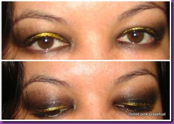
Both pics above: Black + Gold with Urban Decay
2011-11-056
IMG_3563
Illamasqua Lipstick in Kontrol
IMG_4339
Daytime Pumpkin Eyes